Showing posts with label Lucinda Wesson. Show all posts

Thursday, February 14, 2013

Dueling Designers Part Treize

Wilhelmina Cooper for Vogue 1962


LOVE must be in the air this month..
The lovely and talented Miss Amy Graver poked me last week and reminded me that it's been a very very long time since the Dueling Designers had made an appearance...
You know what...she was absolutely right!
The last one was way back in June of 2011!! 

So in honor of THE day of LOVE, Valentine's Day..
We picked

The Fabulous Miss Amy Graver picked a gorgeous palette of warm and cool fuschias mixed with a sophisticated black!
Can that cake look ANY more delicious?!!

For me, being able to work with pink was a dream....
since I just so happen to be surrounded by men...
I simply chose a palette which started at red, moved to fuschia, softened to the lightest of pinks and finally grounded by grey.

So put on those shades...
because these Dueling Designers are gonna brighten your day and warm your heart
on this perfectly perfect
Day of Hearts!!

Elements Design


Chocolate Creative Design

Thursday, June 9, 2011

Dueling Designers...Part Douze..

Image by Caroline Tran

I know it's been awhile, but the Dueling Designers are finally back!!

Over the past few weeks, I have been watching a parade of boats drive by my house ready to be put into the water for the summer season. I know the Tall One has been itching as I just so happened to have married a sailor.

So this time, I couldn't resist choosing Nautical as a theme and good ole Pantone #534C as our primary color. To mix things up a bit, I changed the rules so that we each could choose our own secondary colors.

The Lovely Miss Amy Graver choose a delicious collection of stripes (how could anyone resist James Dean?)and added a pop of cherry red which just so happens to be her signature color.

For me..it was simple...I choose the two colors that I have been completely obsessing over lately...orange and turquoise. 

So close your eyes, hear the gentle lapping of the waves against the hull, smell and taste the salt air on your lips feel a touch of sun on your back..

Elements Design
Row three: Anchor mug: Anchor tee:

Chocolate Creative Design
Top: Poster by Little Types, Rope Earrings by Michelle Lane, 
Boat Image by Kyraart
Middle: Jacket by Debenhams, Poster by Little Minch Art, 
Bottom: Wallpaper by Mini Moderns, Dress by Topshop, 
Pillows by West Elm

Friday, May 6, 2011

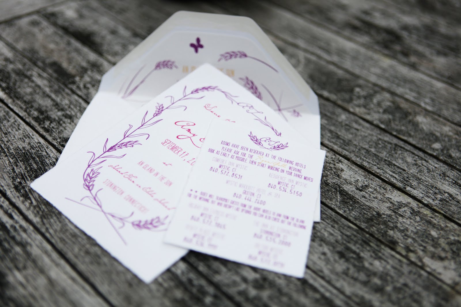
Let your imagination grow..An Island in the Sun..


An Island in the Sun...
I have been dreaming for many years to be able to use these words on paper designed for a wedding on Island Farm..
Finally it was time..
Their eyes were filled with sparkle, glitter and possibly rainbows the first time that I showed them the Island. They are so very much in love, full of hope and true admiration for each other.
Her hair is the same color as the hay when the mid afternoon sun  hits the tops of the fields..He simply adores her. They see the Island for what it truly is..full of energy, life and a bit of wildness..
I dare say I am a little biased as they chose the same place to get married as I.
With just a drop of color and a swirl of whimsey these two beautiful travelers have made a recipe for the most fabulous bohemian chic wedding EVER!

Working with Amy & Tim has been an absolute dream..Reading their thoughtful emails and her squeals of delight as the paper unfolded
certainly made me realize how much I love my job. 
Kinda reminded of a certain sparkly girl..

I think my aha moment(after the save the date was designed) was when I was walking through the "Big House" on the Island with Miss Adrienne O'Connor(something I actually do in my sleep) when I really noticed the vintage wallpaper in my favorite yellow bedroom.
In 11 years, I never did notice the fabulous "Hay Field" on the wall...or did I?
Images by Chocolate Creative Design

Soon we will be embarking on the invitation suite but in the meantime I know that Miss Adrienne O'Connor of Ruffles & Tweed (their coordinator/designer) has some beautiful and fabulous tricks up her sleeve...
I can't wait!

A huge thanks to the lovely Miss Anna Sawin (their wedding photographer)for sending over these amazing images!!

Amy & Tim...the adventure has just begun...
thank you for your trust, spirit and love.

Thursday, April 21, 2011

Dueling Designers...Part Onze..

Image by Laura Moss for Country Living

Spring is in the air, Easter is around the corner, so you know what that means....another installment of Dueling Designers... The loveliest of lovelies, Miss Amy Graver of Elements Design, and I BOTH decided that a soft yellow, such as Pantone #100c or 607c, would be the perfect fit for this particular duel..
How could it not be...with downy chicks and daffodils..
Mellow yellow is where it's at!

Elements Design
Row one :: Bunnies :: Paper bag bouquet  


Chocolate Creative Design
Duck Image: Pinterest  Macaroon image: Pinterest 
Door Image: vi.sualize.us  Dresser Image: Martha Stewart, 
Shoe Image: Aubrey Short  Table Image: Country Living
Dress Image: Anthropologie  Painting:Dalan Wells
Chair Image: Anthropologie

Thursday, March 24, 2011

Dueling Designers...Part Dix..


Aha..after a long hiatus, the Dueling Designers are back!!!
The lovely and super talented Miss Amy Graver of Elements Design and I decided to band together this time to pick the Pantone color and theme of Board Number Dix..
What we came up with was a fabulous little green, Pantone 359 to be exact, and a Cocktail Garden themed Party!!
I myself, was inspired by those lovely and colorful ladies, 
The Housewives of Stonington. Bright coloful prints, fushia colored cocktails, Striped tents (just like my Parent's wedding tent) and ginormous cocktail rings!!

Miss Graver, of course rocked it out of the park, designed
a party that is the epitome of elegance..
Watercolor invitations, glass cloches filled with ferns, herb infused cocktails and seating under trees filled with lanterns...

Elements Design
Row one :: AppleTini :: Cake :: Garden setting :: 


Chocolate Creative Design
Top: Woman: Mad Men,Patio:House Beautiful,
Zebra Coaster: Anthropologie, Couple: Mad Men
Middle: Grass Image: Oh Joy, Ring: Anthropologie, 
Floral Plates: Anthropologie, 
Pink Cocktail:SeattleMet, Pigs in a Blanket: Callahan Catering
Bottom: Print Dress: Trina Turk, Flower Ring: Anthropologie, 
Green Plate: Target

Thursday, February 17, 2011

Dueling Designers...Part Neuf...

Image found via Martha Stewart

With Presidents Day rapidly approaching on Monday, I thought the Dueling Designers should give nod to our first President, Mr. George Washington, with a Cherry Blossom inspired party. What better way to do this than with Pantone's color of the year, Honeysuckle! Once again, the fabulous Miss Amy Graver of Elements Design rocked it out of the park. 

We in the Northeast, were granted a gift of a 50 degree weather day today so I couldn't help but imagine sitting on an old quilt, under a cherry tree full of pink blossoms, in a sweet as pie sundress, eating delicate desserts. Thankfully for us, that time is not too far away as the National Cherry Blossom Festival begins March 26th in Washington, DC.


On the offical Cherry Blossom Festival store site, I was pleased to see that they offer a Give-A-Tree Card. For a mere $5.95, The National Arbor Day Foundation will plant a tree in a National Forest!
What's not to love..a beautiful card and a new tree?!


Elements Design

Chocolate Creative Design
1. Cherry Blossom Cake via Martha Stewart, Bubbles Image via Mary Ruffle, 
Dress via Modcloth
2. Cherry Tree Painting-unknown, Filled with Joy via Mary Ruffle, 
Place setting via The Wedding Chicks
3. Sconce via Anthropologie, Umbrella Image via Mixed Plate, 
Cherry Blossom image via A Beach Cottage

Friday, January 28, 2011

Happy Weekend!!


Elihu Island Winter Love from Buzz Media Company on Vimeo.

Happy Weekend!!
The Island is covered in a beautiful blanket of snow making it perfect for a little sledding this weekend. This film by THE most amazingly talented filmmaker I know, Mike Cyr of Buzz Media Company, created for Chocolate Creative Design's Winter Wedding Shoot, always seems to warm my fingers, toes and heart!

Stay warm and be safe!

On Monday...there will be a little paper feast for the eyes...stay tuned..

Thursday, January 27, 2011

Branding.....and I'm not talkin Cowboy..

Chocolate Creative Design has been super duper busy with some very exciting new projects!! In the past few weeks, I have been working on some rebranding and branding of some of the most fabulous companies which I positively can't wait to unveil in the coming months. Since my pesky website is still a work in progress, I figured that this was the perfect opportunity to demonstrate(shortly and sweetly as I could go on for days)Chocolate Creative Design's creative process.

The best way to illustrate (and one of my all time favorites)is Chocolate Creative Design's branding of the Fabulous Miss Sarah True's company, True Event.


Image found via Domino Magazine

I say...Bring on the color!! Besides imagery, color has the hugest impact on the overall design as it sets the mood, style and tone of your company. I always try to incorporate a mixture of both masculine and feminine colors so that it doesn't eliminate any clients who come knocking at your door, unless of course you are specifically targeting men or women. 


So the hunt begins with my clients searching and rummaging through magazines, books, the internet and even their homes or offices for what truly inspires them. With Miss True, we looked and looked and looked and it wasn't until The Domino Magazine article about Jenna Lyons home, (the Creative Director of J. Crew) that Miss True had the pivotal AHA moment.


Now that the colors have been chosen, it's straight to the drawing board for the design of the company logo. Just like in the choosing of colors, I believe in the combination of both masculine and feminine in the creation of the logo. 


Miss True works with BOTH brides and grooms so it was very important for either of her clients to relate to the design.


To make this work, I combined a very classic strong masculine font with a slightly delicate feminine script. I absolutely love the nod to one of the most famous sculptures in our country, Love by Robert Indiana. When designing a logo, I am completely obsessed with creating something that either has a dual meaning or 
makes the viewer step back, come back and finally have their AHA moment.

When that works, then I know I have done my job!


The secondary Logo is just as important as the primary. It can come in the form of an object or a pattern. Take for instance Henri Bendel. They have a very clean modern font as their primary logo but those amazing chocolate stripes are their secondary. Any woman who sees vertical chocolate stripes can safely assume that it's from Bendels. 


Miss True loved the idea of incorporating the delicate peacock feather along with the strong zebra print. If used creatively and cleverly, anyone who sees a yellow peacock feather or zebra print will instantly think of True Event..
I know I do!


Image via charleswhyte

Here comes the hard part.. editorial. It not only has to be clear and concise but simple and articulate at the same time. What is your company about? Can you describe it in less than two sentences? What is the style of writing and voice that you want to convey?


Most graphic design firms will write the editorial for their clients. I however, believe that it is important for my clients to write most of it themselves. 
It allows them to really think about who they are and where they want to go. 
Of course, I will edit and add in my two cents but this exercise is extremely essential in the creation of their company. Not to mention, it allows me more time to focus on the design.


Image by Justin and Mary Marantz

Now you're speaking my language..Being a photography major, I can't help but a bit of a photo snob. Imagery is what I believe makes or breaks a website. Most companies don't have professional images of their work, office or even themselves so this is why I offer clients the ability to have a great photographer for their project. I have been extremely lucky to have been working with Anna Sawin of 
Anna Sawin photography over the past couple years.


Having a single photographer like Anna Sawin or Justin and Mary Marantz really allows the images to flow cohesively throughout the entire site thus making the site more beautiful and reader friendly!


The whole enchilada! I believe that a website should be clean and simple. It's your virtual storefront and you literally have just have a few seconds to catch someone's attention. So, it should have large beautiful images combined with short yet articulate editorial. For me, it's like putting a 3,000 piece puzzle together and I love every minute of it!


 Just like a story, it should have a beginning, a middle and an end. Toss in your secondary and primary logos and voila...instant website. Ok..it's not as simple as all that but by creatively utilizing those other elements it will allow your site to have cohesion from beginning to end.


I design only in Illustrator..it harkens back to my days in fashion and I figure why change what works. 


Then...the magic begins...


It flies all the way out to sunny California to one of the most talented artists I know..Mr. Jon Michaelsen of Braincloud Media. He is what you call a TRUE web designer. There are a lot of people out there who call themselves "Web Designers" but in fact they are really "Web Architects" as they have no design background. This is why I am really really lucky plus he's really cool, makes me laugh and rocks at animation.


By laying a finger aside of his nose and giving a wink, he magically builds the site. In fact, he is so amazing that he can make an inanimate object such as a peacock feather appear to drift gently and softly through the air and across your screen.


Since Miss True's site had been designed, so many other social mediums have been introduced and are now commonplace in our daily lives. My favorite, the blog, is an absolute must for every business and if you don't have one..GET ONE! Space for Twitter and Facebook should also be allotted into the design as well. Personally, I am still trying to figure out Twitter but I have an account and it is waiting for me when I am ready..


This is where the REAL fun begins....All the design elements are completed so it's time to get really creative and think outside the box! Business cards are an obvious must but there are other things to think about like thank you cards, postcards, custom stamps and my all time favorite...promotional pieces! 
I LOVE to create marketing materials that can cleverly incorporate the primary and secondary logos without ever being obvious.


So there you have it folks..painless, to the point and most importantly a true depiction of how Chocolate Creative Design get things done!!


So get ready for some new and exciting branding and rebranding and see if you can figure out where their inspiration came from!


PS I would swiftly and quickly toodoodloo over to the True Event site as she is in the process of a redesign!!